Logos
Logo Overview
The Katapult logo embodies a simplistic and confident craftsmanship that represents our helpfulness, dignity, and trust.
The Katapult logo is custom drawn. Do not recreate it or its elements. Always use the supplied artwork.
Logo Clear Space and Minimum Size
The Katapult logo must appear clearly and legibly in all applications.
Clear Space
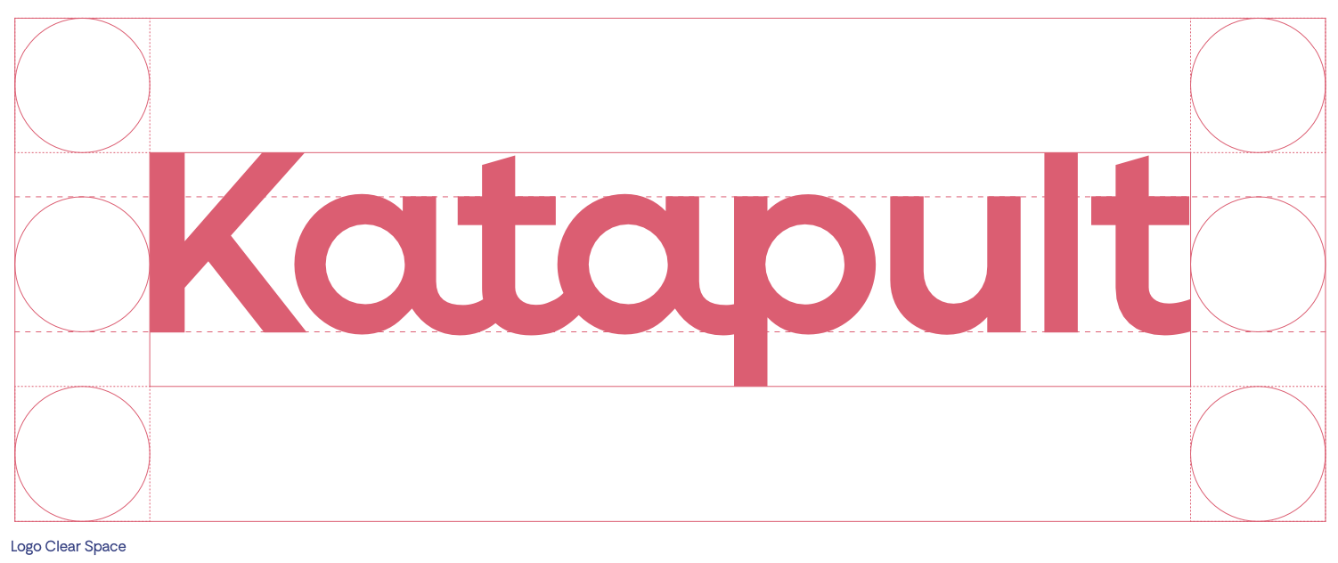
Clear space is the area surrounding the entire logo. It must be kept free of any visual elements, including text, graphics, borders, patterns, and other logos. Clear space is equal to the x-height of the logo, as shown in the schematic to the right. The circles drawn here represent the x-height.

Minimum Size
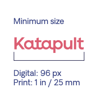
The minimum size is the smallest the logo may appear without compromising legibility. The exhibit shown below indicates the recommended minimum sizes for both digital and print applications.

Logo Color Variations
The Katapult logo is available in three primary color variations: Katapult Pink, Katapult Dark Blue, and White.
Katapult Pink Logo
The Katapult Pink logo is the primary expression of our brand. Use this color variation whenever possible.

| Download PNG |
|---|
| Click Here to Download |
Katapult Dark Blue Logo
The Katapult Dark Blue logo is another variation of our brand expression and should be used as a secondary option to the Katapult Pink logo.

| Download PNG |
|---|
| Click Here to Download |
White Logo
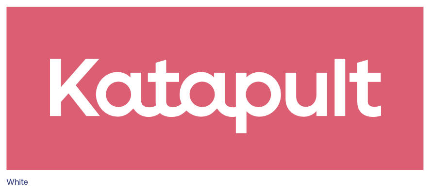
Use the white variation when placing the logo on a solid-colored background.

| Download PNG |
|---|
| Click Here to Download |
Logo Background Usage
The Katapult logo may be placed on any of the colors from our primary palette, provided there is sufficient contrast for legibility.
Do not use the prohibited pairings denoted with a red “X.”


Logo Incorrect Usage
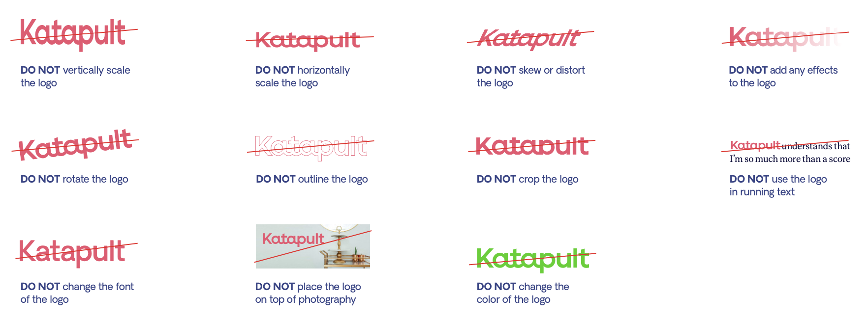
The examples shown below illustrate uses that should be avoided. These usage rules apply to all versions of the logo.

Updated almost 3 years ago
